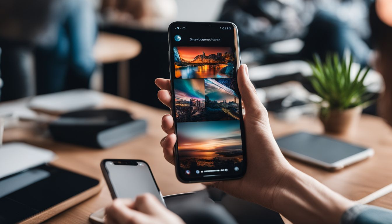
As mobile phones become an ever-present companion in our daily lives, the way we interact with these devices has never been more important. Many of us have faced the struggle of trying to tap a button on the screen that is just out of thumb’s reach, leading to awkward hand shuffling or even dropping our phones.
This common frustration highlights a need for better mobile design that aligns with how we naturally hold and use our devices.
Did you know? A user-friendly interface can significantly improve your time spent on an app. Our article dives into the heart of intuitive mobile navigation—making sure every swipe, tap, and press feels as natural as holding your phone.
You’ll discover ways to make navigating apps easier for users’ thumbs so they can enjoy seamless interaction without second thoughts.
Prepare to revolutionise your approach to mobile design—you won’t want to miss it!
The Thumb Zone: Optimising for One-Handed Use

Understanding ergonomic design for mobile is crucial in ensuring that the user’s thumb can comfortably reach all areas of the screen. Adapting interfaces for thumb reachability is key to creating a seamless and intuitive navigation experience for one-handed use.
Understanding Ergonomic Design for Mobile
Ergonomic design for mobile is all about making sure people can use their phones easily with just one hand. Most of the time, folks hold their phones and tap the screen with their thumbs.
So, designers need to think about where on the screen a thumb can reach without any trouble. This area is called the “Thumb Zone”. It’s like an invisible spot where fingers naturally go when using a phone.
To make apps that feel good to use, buttons and important bits should sit within this zone.
Good mobile design helps users get things done fast and without fuss. For business owners, this means more happy customers who enjoy using your app or website on their gadgets. A well-made interface considers how we handle our devices – keeping essential actions right under our thumbs boosts comfort and speed.
Next up: Adapting interfaces for thumb reachability.
Adapting Interfaces for Thumb Reachability
Keeping in mind what we have learnt about ergonomic design, let’s focus on making sure people can reach everything they need with just their thumb. This means placing buttons and interactive elements where thumbs naturally rest on the screen.
Think about how you use your phone – most times, it’s with one hand whilst you’re doing something else. So, it’s important to put key features within easy reach of the thumb zone.
To do this well, designers must think like the person using the app. Buttons should be big enough to tap without hitting other things by mistake. We also need to consider folks who might have a hard time reaching across a large screen.
By putting critical actions at the bottom of the screen, everyone can use them quickly and easily, which makes for better mobile navigation and happier users.
Designing for Touch: Beyond Clicks and Taps

Embracing gestures and fluid movements in mobile design can enhance the user experience, making interactions more intuitive and seamless. When incorporating haptic feedback, users will feel a greater sense of connection with their device, enhancing their overall interaction.
Embracing Gestures and Fluid Movements
Mobile users love quick and easy actions. Swipes, pinches, and long presses are all natural movements that can make using an app feel smooth. Think of how you flick through photos or pull down a screen to refresh content.
These gestures work well because they don’t take much effort. They’re like shortcuts for your fingers.
Adding these fluid motions to your app keeps the user’s flow going strong. It makes sure people can use your app with just one hand, which is often how phones are held. This kind of design respects how we move our thumbs and touch our screens in real life.
It’s about creating a mobile interaction that feels good and works fast, making every tap count!
Incorporating Haptic Feedback for Enhanced Interaction
Haptic feedback makes using mobile apps feel more real. It gives a soft buzz or vibration when someone taps the screen. This can help users know their touch works without looking. For business owners, adding haptic feedback to your app can make it nicer for customers to use.
They might enjoy the experience and want to come back.
Think about how people hold their phones and use their thumbs to touch things on the screen. Haptic feedback adds an extra layer of comfort for them. It can guide thumbs through different actions smoothly, like hitting buttons or swiping through menus.
Your users will get quick responses from touches, which helps them move around your app with ease.
Mobile SEO Mastery: Strategies to Boost Visibility in the Small Screen Era
To get seen on small screens, your mobile site must show up in search results. Good mobile SEO helps a lot here. Use keywords smartly and make sure your website loads fast. This way more people can find you when they use their phones to look for what you offer.
Make it easy for them to use your site with clear menus and big buttons.
Keeping content front and centre is key for business owners. Your website should have the information that people want right away without scrolling too much. Google likes websites that are made well for phones.
So, making your site better for mobile can also help you rank higher in search results. Keep things simple so customers can enjoy visiting your site on any device they choose.
Visual Hierarchy in Mobile UI: Guiding the Thumb’s Journey
Create a seamless mobile experience by prioritising important elements within the thumb’s reach. Utilise bold typography, actionable elements, and streamline navigation with cards and lists to guide the user’s journey through your mobile interface.
Bold Typography and Actionable Elements
Bold letters catch the eye. They make words stand out on a small screen. When designing mobile apps, use big, bold text so users can read it fast and easy. This helps them understand where to go next.
Action buttons should be easy to see too. Make them big enough for thumbs to tap without mistakes.
Place these buttons where fingers reach best – usually at the bottom of the screen. This makes your app simple to use while holding a phone in one hand. Clear, touchable elements guide users through their tasks quickly, making sure they have a good time using your app.
Streamlining Navigation with Cards and Lists
After setting up clear text and buttons for the thumb’s path, let’s make navigation even smoother with cards and lists. Cards group related information in a neat, easy-to-tap area that fits nicely on mobile screens.
They work like mini web pages that users can swipe through without losing their place. Lists also help by lining up options so it’s quick to scan and pick what’s needed with just a thumb press.
Using cards and lists means items are big enough to touch easily and spaced out so thumbs don’t hit the wrong thing. This setup helps business owners guide users right where they want them, making sure every tap counts towards a good experience on their mobile app or website.
Keep these elements within the thumb zone at the bottom of the screen, so everything is always just a thumb-stretch away!
Mobile-First Design: Prioritising Content and Functionality
Simplifying menus for quick access and utilising off-screen space efficiently are essential in mobile-first design. By prioritising content and functionality, businesses can create a seamless and intuitive user experience for their mobile users.
Simplifying Menus for Quick Access
When designing a mobile app, consider simplifying menus for quick access as a thumb-friendly principle. Placing important navigation options within easy reach of the thumb enhances user experience and engagement.
This can be achieved by streamlining menu structures and prioritising frequently used features for effortless one-handed operation, ultimately boosting usability and satisfaction for mobile users.
Utilising off-screen space efficiently is another key tactic to enhance mobile navigation design. By intelligently organising menus and content, you can optimise the user’s interaction with your app, making it more intuitive and accessible.
Embracing these principles empowers business owners to create mobile interfaces that prioritise ease of use and seamless navigation for their audience.
Utilising Off-Screen Space Efficiently
Make sure to use the off-screen space efficiently when designing your mobile app. Placing essential navigation or interactive elements strategically off the screen can enhance usability and user experience.
It’s crucial for business owners to understand that maximising off-screen space helps in keeping the interface clutter-free while ensuring easy thumb reachability for users, contributing significantly to a seamless navigation experience on mobile devices.
When considering navigational efficiency, it’s important to streamline access points and menus effectively to ensure smooth interaction for users. This approach not only enhances user satisfaction but also plays a vital role in increasing engagement with your mobile app, ultimately leading to better business outcomes.
Conclusion: The Future of Thumb-Friendly Design
In conclusion, designing intuitive mobile navigation revolves around optimising for one-handed use and embracing gestures and fluid movements. The practical strategies discussed in this article simplify menus for quick access, streamline navigation with bold typography, and prioritise content and functionality.
Implementing thumb-friendly design principles is not only important but can also lead to increased user engagement and improved user experience. By considering the way users hold their gadgets, particularly mobile devices, robust navigation can be achieved through thoughtful interface design.
For further exploration of these concepts, readers are encouraged to delve into additional resources on mobile UI/UX design and finger-friendly interfaces. With these approaches in mind, let’s revolutionise mobile navigation by prioritising thumb-friendly design for enhanced user experiences.
For a deeper dive into optimising your mobile presence, consider exploring our comprehensive guide on Mobile SEO Mastery: Strategies to Boost Visibility in the Small Screen Era.


